Energy Information System Product Analysis
*This was written in early 2023, with less than a year of Product experience
Introduction
Problem Statement
Buildings account for over 38% of U.S. total energy usage and 76% of electricity consumption. Whether driven by cost, compliance, or climate goals, managing building energy consumption is a high-stakes priority for owners and facility managers. Yet, traditional energy management relies heavily on manual, error-prone processes, lacking real-time visibility and actionable insights.
There is a clear opportunity for an automated Energy Information System (EIS), one that integrates seamlessly with existing building systems, provides granular data on energy usage, and translates that data into insights that reduce energy waste, costs, and emissions.
This case study reflects a portion of the energy product strategy and research I worked on during my time at WennSoft, focused specifically on electricity usage from HVAC systems.
Breakdown
So how do you reduce the energy consumption of a building? What about utility costs specifically?
Reducing a building’s energy usage starts with identifying inefficiencies across three key areas:
Structure: Poor insulation, windows, doors, and building envelope issues cause unnecessary heating/cooling losses.
Equipment: Aging, faulty, or unoptimized HVAC and lighting systems waste significant energy.
Operations: HVAC systems running during off-hours or lights left on in unoccupied spaces drive avoidable consumption.
Onsite generation (e.g., solar panels, small wind turbines) can also offset usage, reduce utility bills, and return power to the grid.
This analysis focuses on how an EIS can help identify, track, and act on inefficiencies, especially related to HVAC—consistently the largest energy consumer in commercial buildings.
According to the 2012 Commercial Buildings Energy Consumption Survey, HVAC alone accounts for the majority of total energy use, followed by lighting and plug loads (e.g., electronics, appliances).

An obvious conclusion from this is that HVAC equipment presents a major opportunity for reducing energy consumption and should be a priority for Energy Information Systems.
Data Methodology
Utility Data
The most direct way to understand a building’s energy use is to integrate utility billing data. Platforms like UtilityAPI or Urjanet offer access to both monthly billing data and high-resolution interval data (~15-minute granularity). This enables both macro- and micro-level energy tracking.
However, site-level utility data alone isn't actionable. Facility managers need equipment-level visibility to pinpoint inefficiencies and prioritize upgrades.
Virtual Energy Meters
In a perfect world, we would have data on every single device that draws power in the building. Including when it is on, how much power it is drawing at that time, what it’s costing us in utilities, etc. Unfortunately, this data is not perfectly available.
Ideally, every device would be sub-metered, but that’s cost-prohibitive, impractical and rare in practice. Instead, we can create Virtual Energy Meters using data from IoT sensors already present in Building Automation Systems (BAS) in order to simulate equipment-level energy granularity.
Key available data includes:
Temperature: Supply and return air temps, thermostat setpoints.
Equipment State: On/off status, fan speeds, valve positions.
Occupancy: Motion/heat signature sensors that determine room use (and/or building occupancy from access control systems).
Now, for the purpose of our Virtual Energy Meters, we only really care about the sensors that determine when a piece of equipment is on or off. Because the logic we’re going to implement is:
IF the Equipment is ON
THEN Power = 100 kW
ELSE Power = 0 kW
…where the “100 kW” figure is the power that this equipment is consuming when it is on. For most equipment, you will actually have multiple Virtual Meters that simulate the different components of the equipment. For example, a VAV consumes energy when:
It’s supply fan is on → 10kW
It’s return fan is on → 8kW
It’s heater is on → 12kW
These values are typically listed on the nameplate of the equipment and documented by the facility management.
Based on this logic, we might expect a low-fidelity, binary behavior like this when we look at power over time for one Virtual Meter:

However, when we stack many Virtual Meters up to include our entire site, we might see something like the following behavior, with a more continuous curve and higher usage during working hours:

Cost & Emission Factors
While energy is obviously the “core” metric that we’re tracking, the real impact of energy consumption is the cost of the electricity and the equivalent emissions that the energy produced in the process of being generated.
Energy costs depend on complex pricing structures, especially for commercial users. Key pricing components include:
Fixed & Consumption Rates
Time-of-Use Pricing
Demand Charges
Ratcheting (peak-based charges over extended periods)
Minimum/Maximum thresholds for eligibility or penalties
Most residential customers will have a simple rate structure based on a fixed rate and a consumption rate. However, many commercial & industrial customers have much more complicated rate structures.
The highlighted rates above are particularly important for customers to know.
Luckily, this pricing data is available via API by companies like Genability, allowing for a seamless conversion from energy use to cost.
On the other hand, converting energy use into an equivalent amount of emissions is somewhat more straight forward. This conversion factor is simply based on the type of energy generation sources that the electricity is drawn from. Utilities will generate their power based on some proportion of coal, natural gas, nuclear, renewables, etc., which all contribute to carbon emissions at different rates. Based on these proportions, the equivalent greenhouse gas emissions per kWh can be calculated.
Companies like Persefoni can help automate this calculation.
Solutions
Energy KPIs
Based on the above information, other online research, and the feedback I’ve gotten from customers, I’ve compiled a list of the primary insights and metrics that facility managers might find valuable for tracking building energy consumption and taking action to reduce it:
Total energy use, utility cost, and equivalent emissions for a given a period (both at the site- and equipment-level)
Power use and cost rate at any given time
Peak demand in a period
Recent energy use compared to historical performance
Total energy, cost, or emissions reduced/increased since a previous date
Recent energy use compared to a reduction target
Total energy, cost, or emissions that still need to be reduced to hit your goal
Energy Views
For the remainder of this post, I will be describing the different features and views that would be valuable to include in an Energy Information System based on the above points.
A graph very much like the one I showed above that measures power at a short interval (~15 minutes). Along with power measurements, we should include a notification system that notifies users when the power demand reaches a certain point. This is to help them avoid demand ratchet charges.

Similarly, a graph that shows energy consumption over a period, where each point is a subtotal that is grouped by the day, week, month, etc. Ex., by month:
Of course, it would be useful to have this data in tabular form. Including timeseries data for all of these views, as well as a detailed view of energy use by equipment for any period of time:

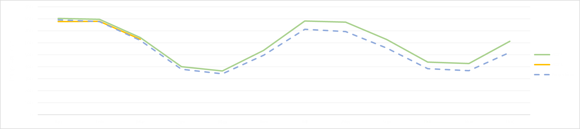
Next, we have a similar view to the graph above, except we’re incorporating a projection of the historical “baseline”. The baseline is defined by a machine learning model that is trained on at least a year’s worth of energy, temperature, and occupancy data. It takes inputs of heating degree days, cooling degree days, and # of occupied hours of the building, and outputs the predicted daily energy use. In the example below, a major equipment improvement was made on 7/1/22 and a reduction in the actual energy use can be seen. By comparing actual performance to our baseline, we can assess the perceived impact of equipment/performance improvements (listed to the right):
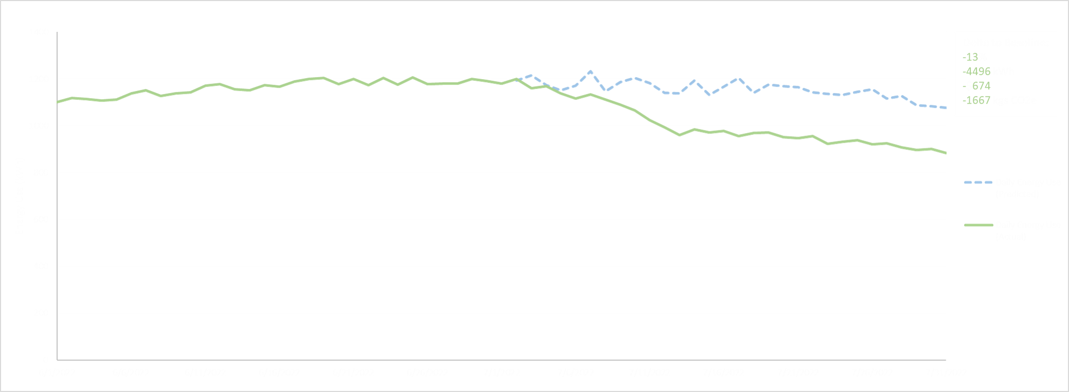
Lastly, users may have an energy reduction goal - “We want to reduce our energy use by 10% by the end of the year.” By incorporating this goal into our baseline model, we can create a energy use forecast that decreases to the specified target by the end of the year. Using this target line, we can compare our current energy performance to this target to assess progress.